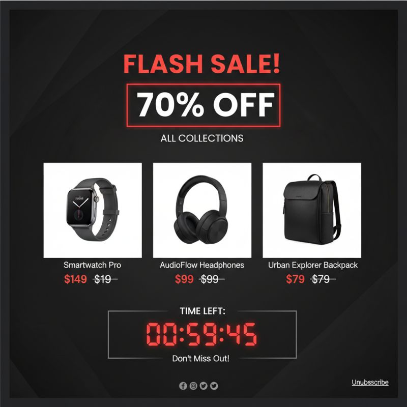
Email design evolves more slowly than the web, but 2026 brings a few shifts worth knowing. The biggest is dark mode: roughly half of users now read email in dark interfaces, and templates that ignore it look broken by default.
The practical answer is designing for both. Use transparent images where possible, test colors in inverted interfaces, and add the meta tags that tell mail clients to preserve your brand colors.
Minimalism keeps winning. Single-column layouts, generous whitespace and one clear call to action outperform busy newsletters. Readers scan the inbox in seconds, so hierarchy is everything.
Interactivity is maturing. AMP for email and CSS-based interactions like hover effects and carousels now work in most major clients, letting recipients browse products or confirm appointments without leaving the message.
Finally, accessibility is no longer optional. Semantic structure, alt text, sufficient contrast and a minimum font size of 14 pixels make your emails usable for everyone — and improve deliverability signals along the way.
Our email template packs are built on these principles: dark mode ready, fully responsive and tested across every major client.